Brand Strategy
Creative Direction
Packaging Design
Photography & Video
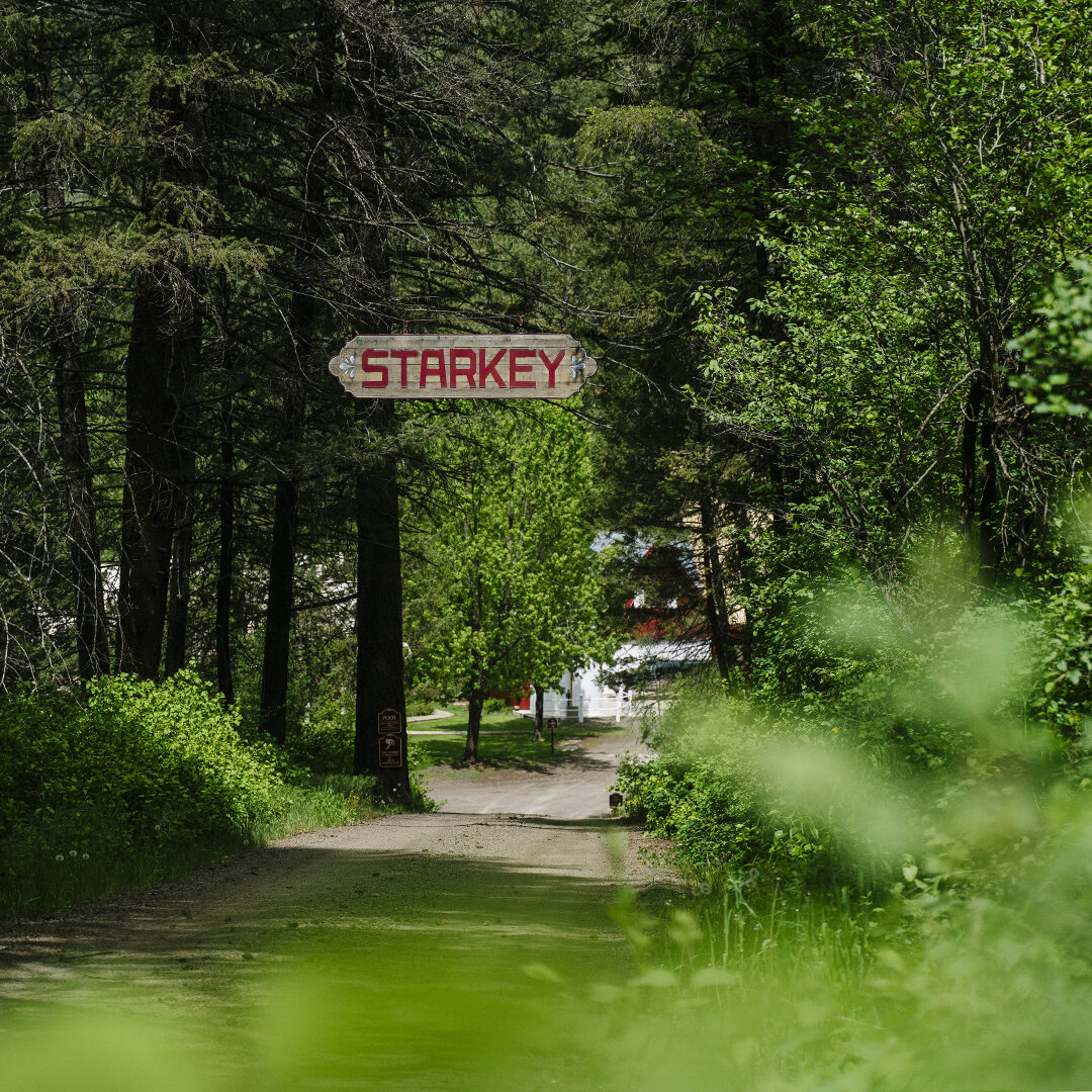
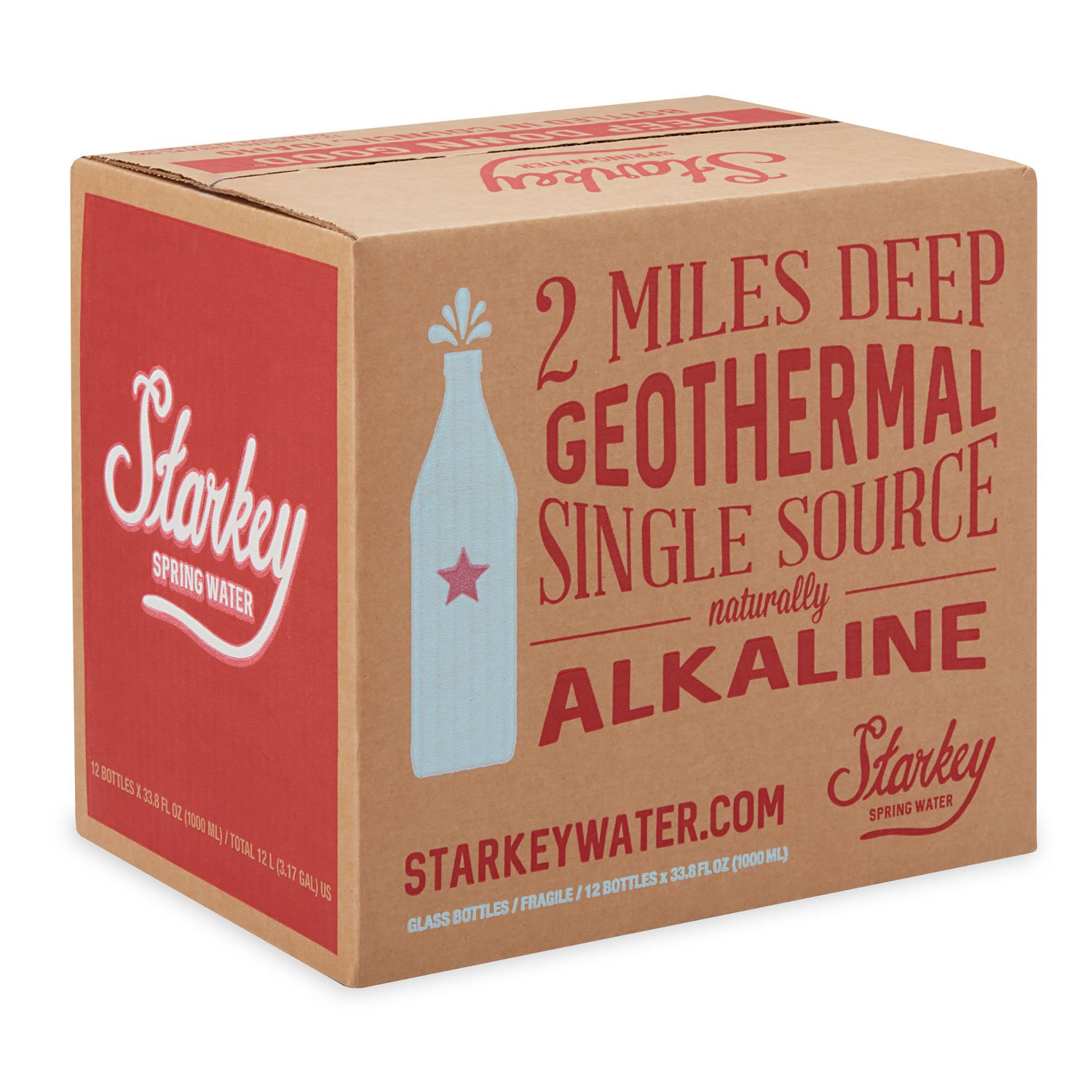
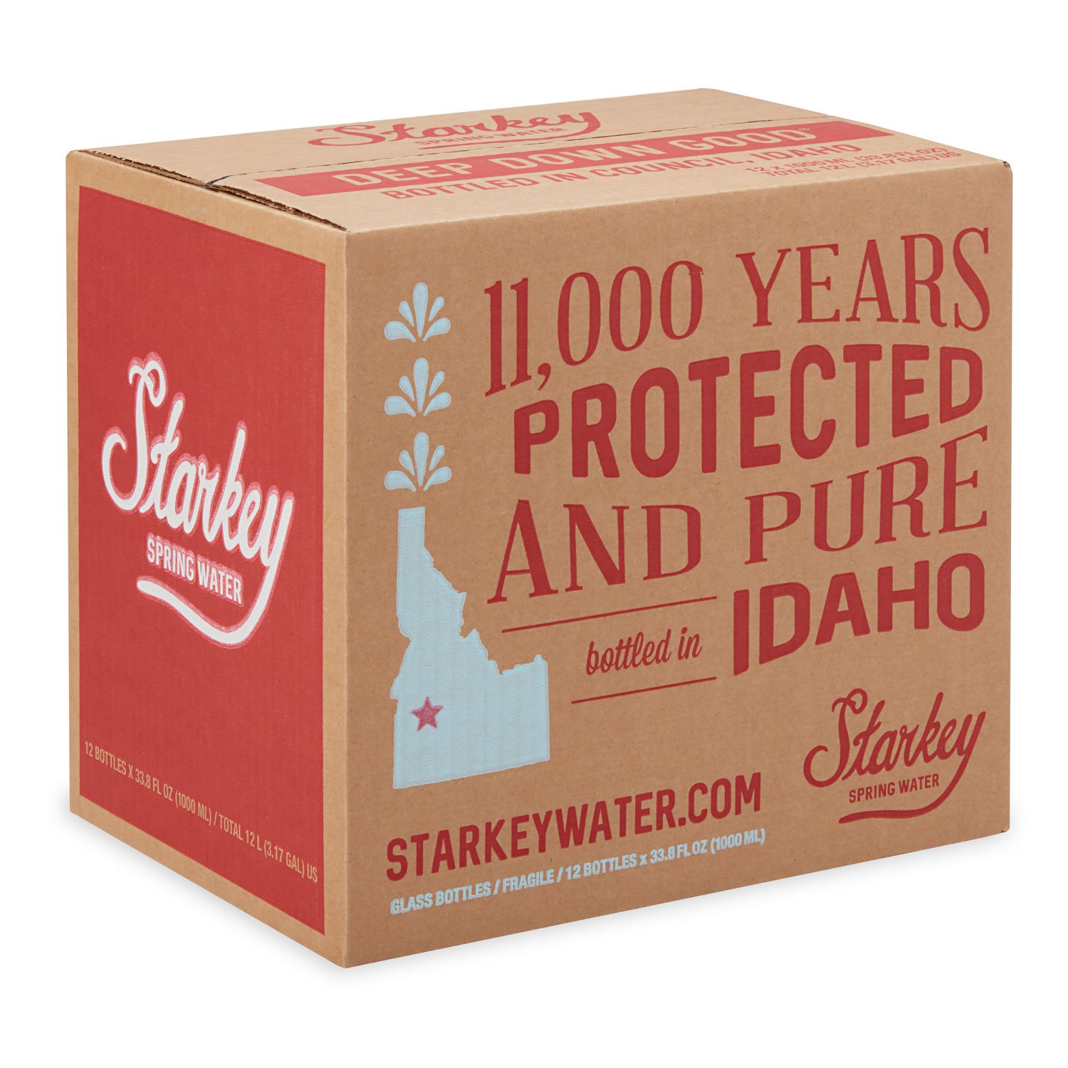
Starkey Spring Water comes from a protected, single-source geothermal spring deep
in the rugged terrain of western Idaho. With a natural pH of 9.2, this water acquires essential minerals from the earth as it flows from two miles beneath the surface, passing through volcanic basalt before emerging pure and untouched.
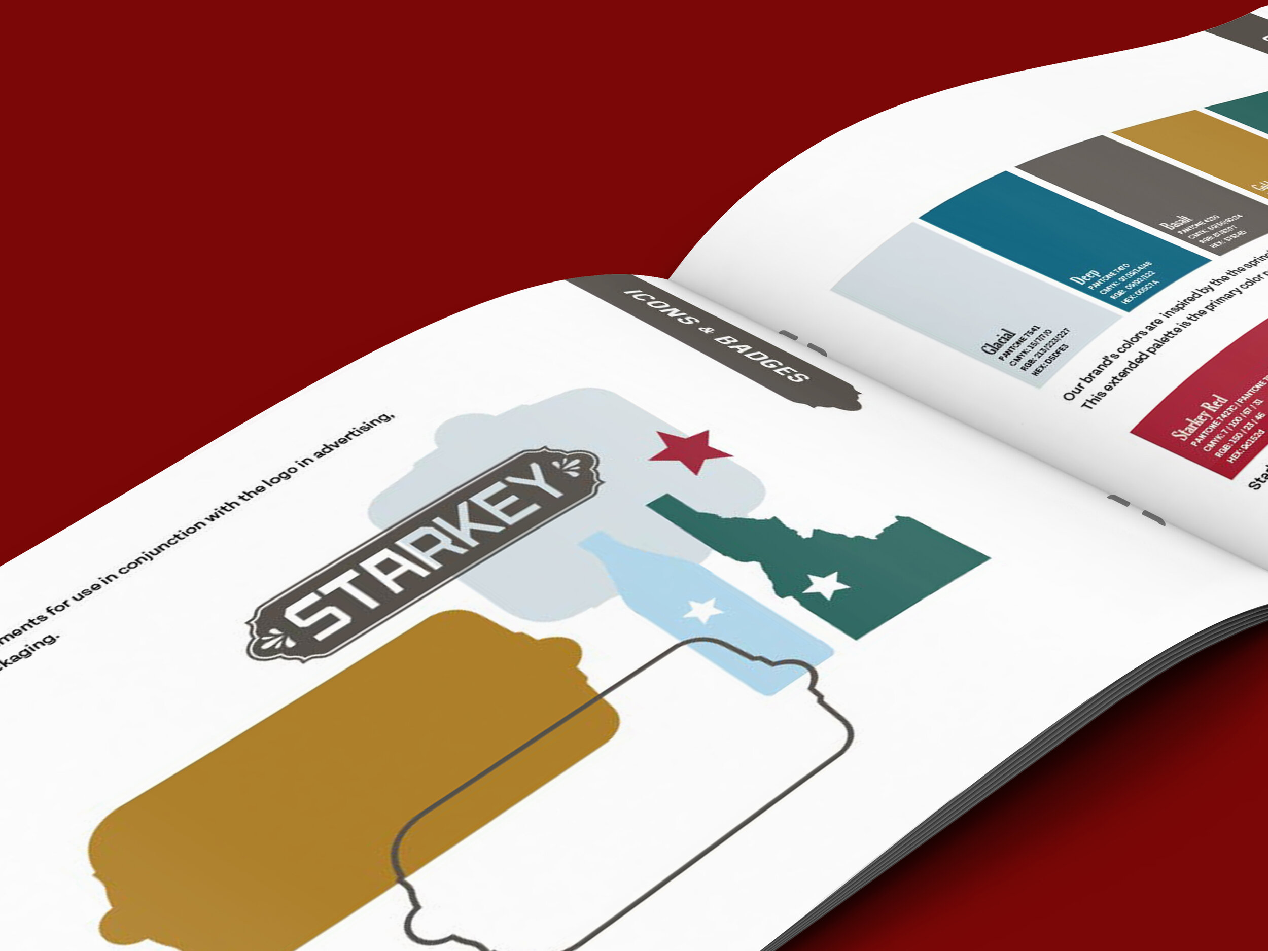
The original branding paid tribute to the water's rich history. Its nostalgic script logo, classic American color scheme, and messaging highlighted the water's natural qualities and storied past. As the brand progressed, its audience expanded to include a diverse range of alternative athletes and outdoor enthusiasts, attracted the unique attributes
of the water.
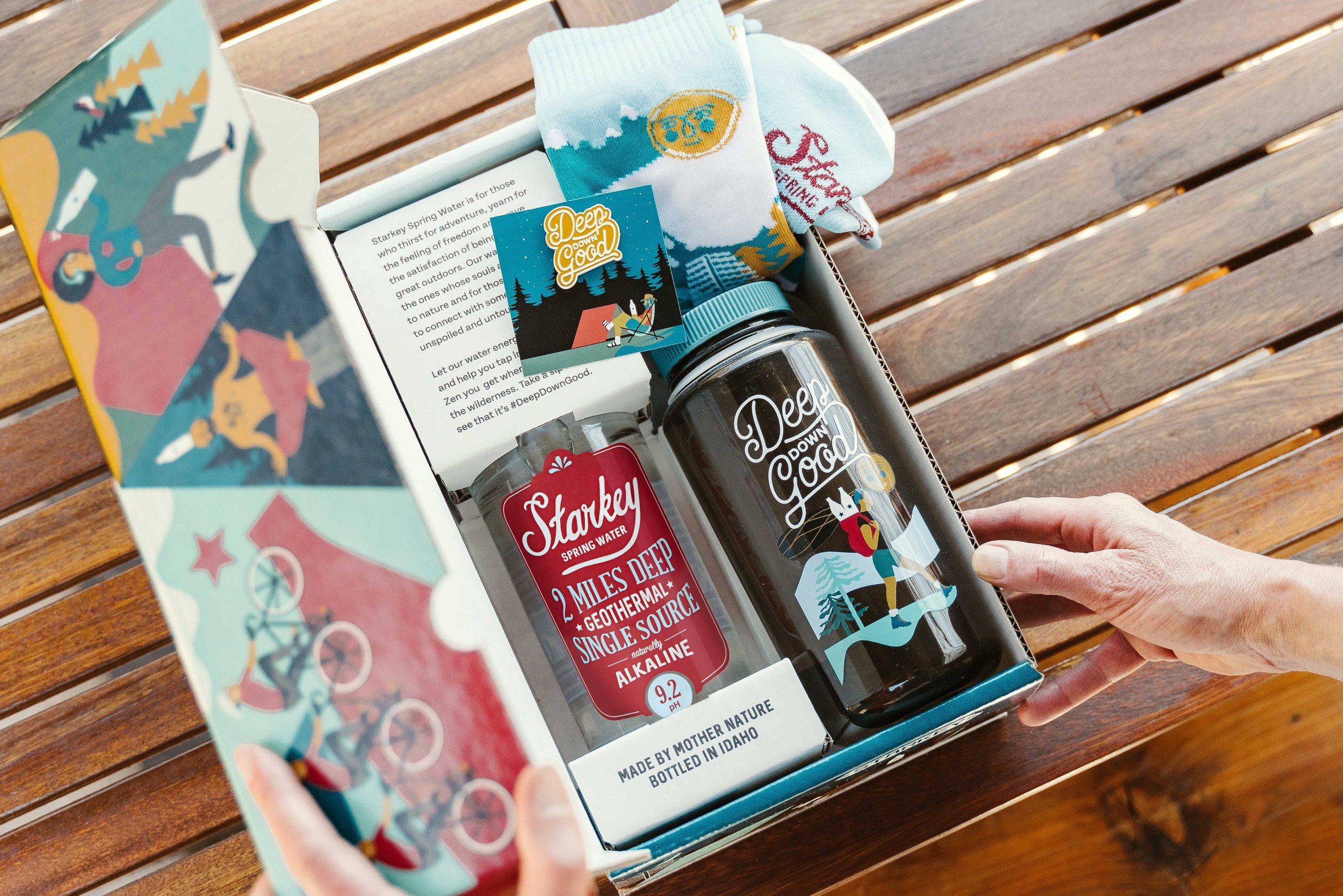
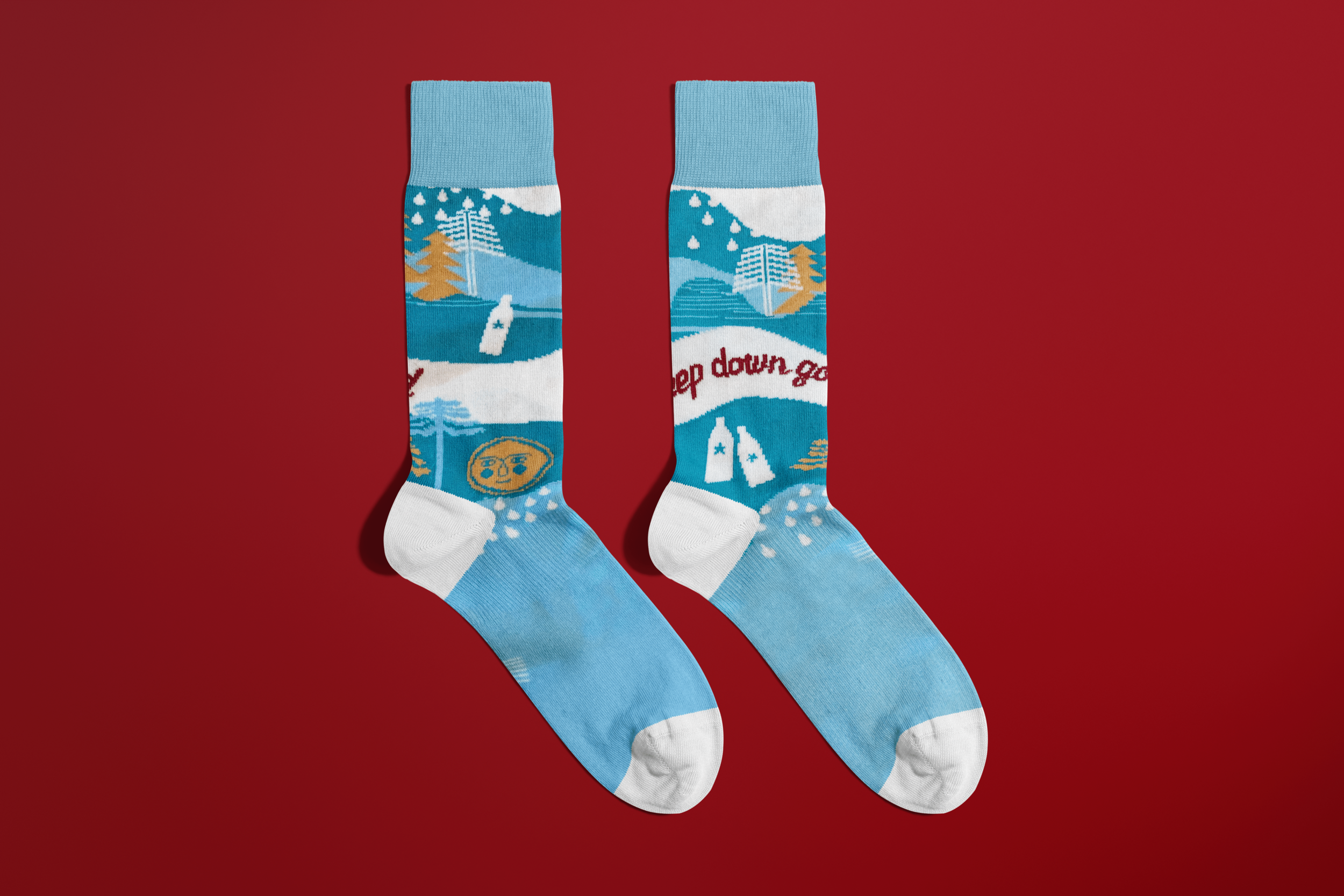
I led a strategic evolution and brand expansion to update the brand logo, packaging, and messaging structure. The color palette was broadened to infuse creativity into the brand's executions, and a refreshed library of photography and video content supported the brand's growth.
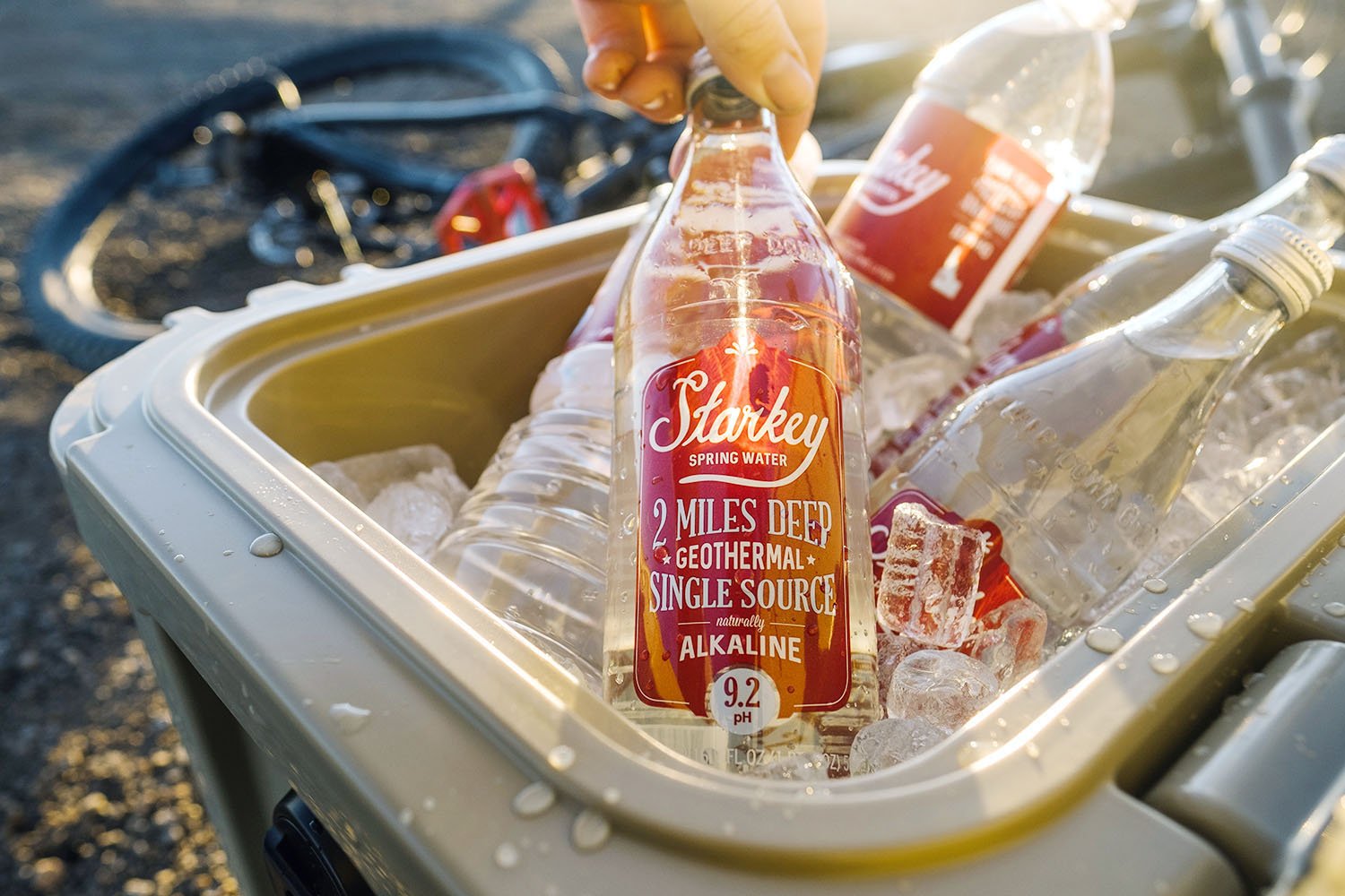
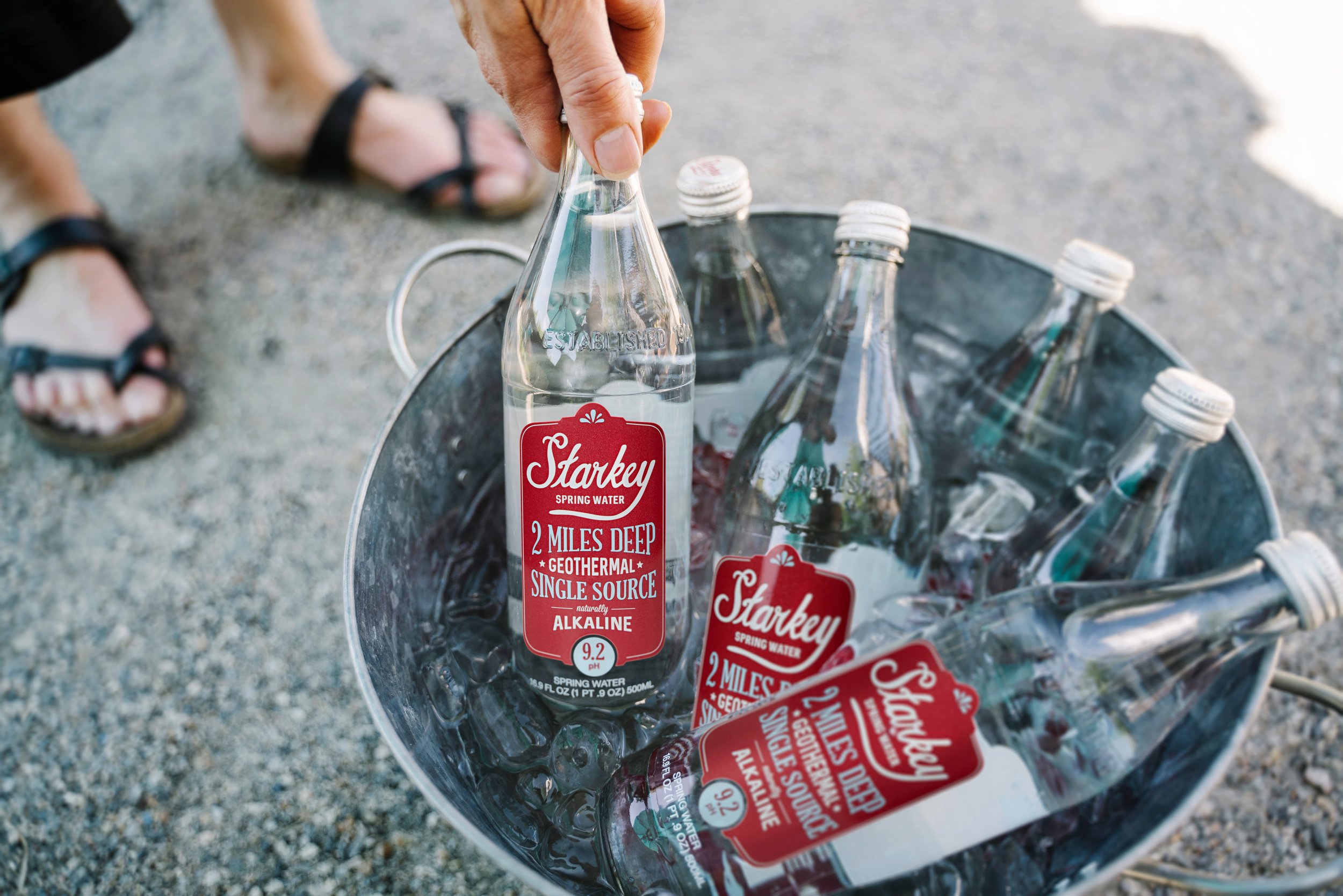
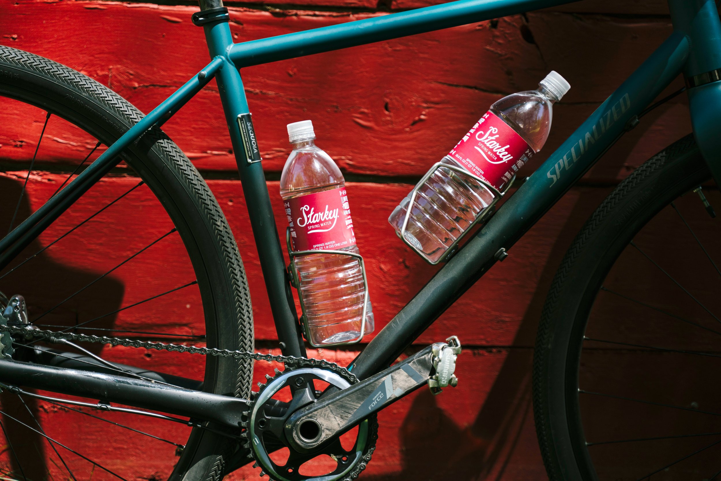
Starkey Spring Water is for those who thirst for adventure, yearn for the feeling of freedom and crave the satisfaction of being in the great outdoors. Our water is for the ones whose souls are bound to nature and for those searching to connect with something unspoiled and untouched.
Take a sip and you’ll see that it’s Deep Down Good.


Creative Director: Lisa Rockwell
Illustrator: Kym Foster
Designer: Charleigh Linde
Photography / Video: Adam Concannon